AI
7 Red flags, in Another Data-Misinterpretation Wave – Will AI Mitigate it?

Statistics climbed from an unpopular school subject to top of the agenda in 2020, and skilled data analysts are in short supply in the year of astoundingly-exponential curves. Although health–related AI and data analysis expand, many surprisingly well-informed academic graduates still get cheated by rush-job presentations of correct data compiled from reliable sources. This incomplete list of red flags provides some inspiration for your own rules of thumb and your news assessment.
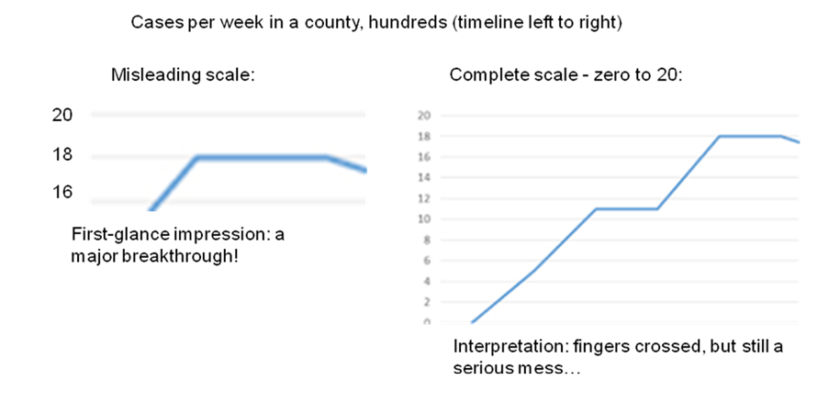
1. Curves on “favorably incomplete” scales
– sometimes to save space on a page, but sometimes it seems intentional:
2. A rush to publish absolute figures (and sometimes even compare them…)
This is becoming frequent in countries that stand out in Covid-related fatalities per100,000. Even if correct, absolute figures aren’t comparable; sometimes they rather conceal than inform.
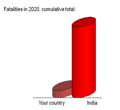
In Sweden: extend the left bar 138-fold first, to make the two comparable, before drawing any conclusions. (On Iceland: 3,940-fold. Etc.) Or, simply go to reliable sites that offer sorting of the tables by a population-adjusted column.
3. “Exponential” as a synonym of steep.
Even linear growth can be steep, which is easy to see, although its pace is constant:

Exponential growth requires more thought and imagination: it doesn’t start so steep, and given an exponent close to 1 it doesn’t seem steep at all:

However, suppose we’ve only ten infected patients, a modest R value of 1.15 , and we estimate their subsequent cases, via 1st-hand infection and way “down the road” to 10th-hand. The sum total along these ten trees (pathways) will exceed 200. But, assuming a slightly increased R of 1.25 instead, it’ll exceed 330. Unlike a steep linear slope, exponentials cheat our intuition, and cheat decision makers into delayed inconsistent lax decisions.
Moreover, Corona viruses are a moving target, because they mutate fast. Distancing, discipline, strict steps and measures “tame” them in a matter of weeks, and gradually reduce lethal cases to near zero. The reverse, delayed and lax measures increase the R and genetically “favor” aggressive strains instead…
4. Mistaking a correlation for causality
It’s raining when gardeners turn their sprinklers off. True, but figuring out the direction of the cause-effect relationship takes some experience. Kids tackle it by learning and common sense. AI R&D is tackling it by several methods, e.g. logical exclusion (ruling out, for example, a common third cause, causality chains, etc), and by widening it from Narrow AI toward Full AI and commonsense reasoning. Using Wikipedia and the Internet as a vast training-data lake takes us to (many) baffling trifles of Big Data.
5. Leveling up
Donald Michie, meant that information mining uncovered the tacit know-why hidden in human know-how (represented in statistics about previous decisions). In its training phase, the ML algorithm became a hypothesis creator. Then, during test and field test, the ML-generated logic became a hypothesis tester.
However, as the training datasets scaled up from thousands of rows to millions or billions (and the number of columns, i.e. attributes, expanded as well), the number of possible correlations exploded; some of them were meaningful, others extremely far-fetched. This was often nicked “mass significance” (so, disease gravity could correlate with trifles like, say, shoelace color on patients’ shoes).
6. Input: mass versus relevance and accuracy
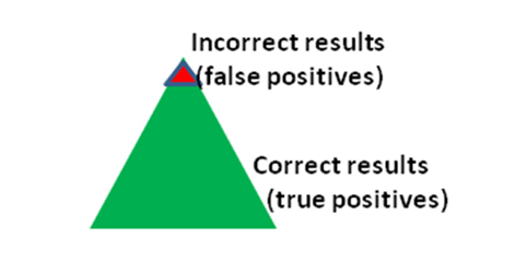
Suppose in targeted Covid-testing, we focus on high-risk segments such as paramedics, doctors and nurses. Now assume that, regrettably, 96% of these are really infected. Then, most of Covid-positive test results are real positives, and only a couple of percent are false positives, because of the extreme situation in those well-chosen segments of our real world:
Now, more time-consuming lab tests double-check and confirm that our test-campaign figures were quite accurate. So we scale it up, right away, and test everybody in our country. Now assume that, luckily, 96% of our 20 million-population is negative (not infected). Hence most of Covid-negative test resultsare real negatives, and only a couple of percent are false negatives, because of the fortunate situation out there. Again, lab tests confirm it’s correct.
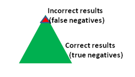
Too good to be wholly true? Well, in the 1000-times bigger data (20 million tests), those red triffle-percent false negatives at the top (that is, of Covid-infected “misses”, still spreading the virus) can approach half a million, although most positives were false alarms now (again because of the auspicious situation in the country as a whole). So, the colors from the first round (the risk-group tests) are now reversed on the positives side.
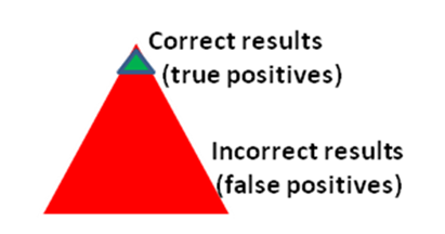
Consequently, even if the number of quarantined people might happen to be approximately right, most of them are nevertheless the wrong guys. Whereas, up to half a million of infected false negatives are running around…
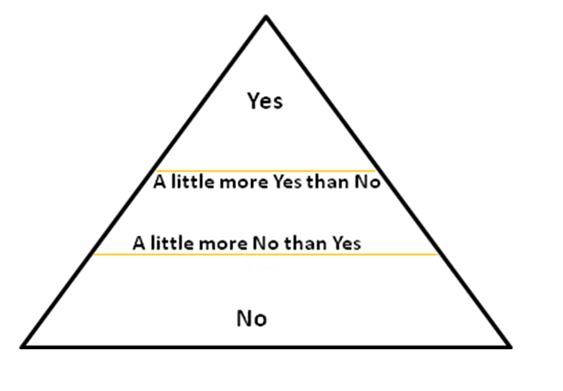
7. A level-up: The fuzziness of real-world variables
The scaled-up part (of 6. above) raises a question: how much of a real danger are all those false negatives out there?
Our data analyst points out the objectives of our test campaigns: In the small segment, it was primarily correct diagnosis and treatment of infected staff, and we could even afford some pre-test diagnostics and repeated Covid-tests minimizing false negatives further, to get a clear No or Yes (sick) for each individual. On the other hand, the objective of the scaled-up tests is primarily tracking, to isolate outbreaks; this calls for attention to a grey zone between Yes and No: people with virus particles per million (ppm) near limit (for Covid: 100,000 ppm), where the risk of transmission nears zero.
Time-comsuming accurate tests are very sensitive (down to a couple of hundred ppm), which was important in the diagnostics, but now we’re fine with down to 100,000 for tracking purposes; here, paradoxically, not-so-good sensitivity of quick tests comes in useful (makes this bug a feature, so to say) , because positives that are no longer infectious are less interesting to track. This narrows our grey zone, although not erases (it’s still a zone, not a hard fine line). We have to live with some fudge-factor in a real world where 99,999 ppm doesn’t mean 0.0% risk of transmission, and 100,001 doesn’t mean 100.0% risk. So, our recent “binary” classification (cases either Yes or No) is becoming akin a fuzzy truth function.
Last: remember the two-way street between ML and data
Each level-up of complexity makes our brains a bit more dizzy. My point is: unlike our AI systems.
ML not only constrains, but also assists data architects. Therefore, “antipatterns” similar to the first six red flags are something AI systems can help us recognize, pattern-match to recent cases, and warn for (in data presentation and elsewhere). They can also provide useful advice as complexity grows (like 7. above, for example). Likely, similar pattern recognition & matching will become part of data pipelines and DaaS/MLaaS, along with pattern-matching inventions within hard-core database-tech for Big Data (e.g. “learned indexes” by Google, for fast lookups). The cost of the training phase in ML is only a fraction of the pipeline sum total. Think: data ingestion, storage, preparation, ML, deployment, field test, governance, upgrades…
Therefore, quite some automation of data pipelines will augment ML and data architecture for years to come. Innovation sparked by Covid-research will turn out helpful in many other kinds of monitoring, forecasts, prevention, emergencies, and industry sectors.
Stay safe!
AI, Architecture, and Machine Learning (November 2020)
Agile Architechture Fundamentals (December)
(on demand: Modular Product Line Architecture )
(on demand: Avancerad objektmodellering med UML )
Trainer at Informator, senior modeling and architecture consultant at Kiseldalen’s, main author: UML Extra Light (Cambridge University Press) and Growing Modular (Springer). Advanced UML2 Professional (OCUP cert level 3/3).
Milan and Informator collaborate since 1996 on architecture, rules, AI, modeling, UML, requirements, and design. You can meet him this year at public courses, in English or Swedish (remote participation is offered, encouraged, and currently highly recommended by epidemiology experts).